

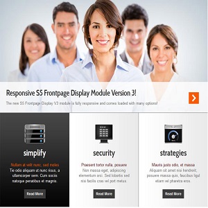
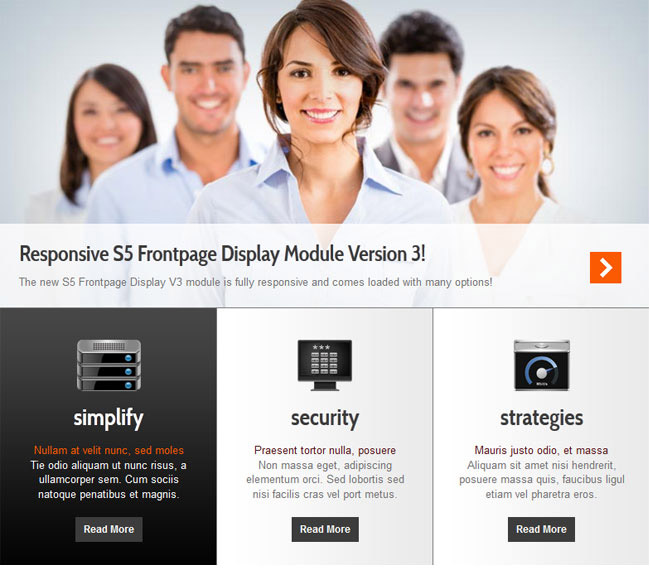
Version 3:
Version 3 is totally responsive, and consists of one main display area and 2-9 boxes below that control the main display area that can be split into multiple rows. The main content area and boxes are fully customizable by allowing to you specify your own images, sizes, hyperlinks and much more to adapt to any template! Setup is very easy, by simply supplying images for the top area, background images for the boxes, and your own custom html for each box.
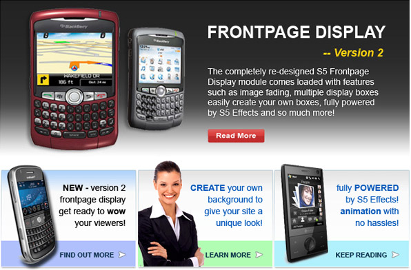
Version 2:
Consists of one main display area and 2-8 boxes below that content that control the main display area. This new version makes it even easier to create your own custom look and now has a fading transition effect! The main content area and boxes are fully customizable by allowing to you specify your own images, sizes, hyperlinks and much more to adapt to any template!
Version 1:
consists of one main display area and 2-6 boxes below that content. These boxes have their own content and control the content of the larger main display. This module is fully customizable with colors options, sizes, hyperlinks and much more to adapt to any template!
Features:
- Fully responsive width and bottom boxes.
- Responsive re-distribution. Configure the bottom boxes to re-size at your own specified page widths.
- Fading transition.
- Width of boxes (set individually).
- Margins of both top and bottom area.
- Show between 2 and 9 boxes, that can be split into multiple rows.
- Set the background position and repeat of each box.
- Choose to cycle the boxes automatically or manually.
- Choose the display time.
- Use any image for the boxes and top area.
- Create hyperlinks for the boxes or top area.
- Open hyperlinks in a new window or same window.
- Insert your own HTML code.
Add comment