

Responsivizer 2.10
همانطور که می دانید در الگوریتم های جدید گوگل سازگاری سایت با موبایل و تبلت بسیار حائز اهمیت است. responsiver یکی از کامپوننت های بسیار کاربردی جوملا می باشد که قالب سایت شما را واکنش گرا می کند. بدین معنی که سایت شما در رزولوشن های مختلف و در موبایل و تبلت به خوبی نمایش داده می شود و دیگر مشکل بهم ریختگی نخواهید داشت. این افزوه یکی از کارآمدترین افزونه های سازگاری سایت با موبایل و بهینه سازی آن است که در سایت اصلی جوملا نیز با استفبال گسترده کاربران روبرو شده و رتبه 100 را از آن خود نموده است.
اما این افزونه ها چگونه کار می کنند؟ شاید این سوالی باشد که در ذهن خیلی ها بوده باشد: این افزونه ها معمولا با شناسایی موبایل و تبلت و تشخیص رزولوشن صفحه قالب مخصوص به صفحه موبایل را نمایش می دهند که می توانید انتخاب کنید که چه قالبی مخصوص موبایل و با چه چینشی نمایش داده شود. البته افزونه فوق دارای قالب مخصوص موبایل و امکاناتی جهت بهینه سازی و ریسپانسیو کردن سایت نیز می باشد.
از امکانات جالب این کامپوننت می توان به دارا بودن 4 استایل منوی مخصوص موبایل اشاره کرد که شمارا از خرید و نصب پلاگین های موبایلی بی نیاز می کند.
| نمایش ها | 14,247 | دانلودها | 150 |
|---|---|---|---|
| نسخه: | 2.10 | ايجاد شده | 1394-06-12 |
| سيستم | Joomla 1.5 & 2.5 & 3 & 4 | به روز رسانی در | 1403-01-22 |
| وب سايت | صفحه نخست  |
توسعه دهنده |
J!Extensions Store |
| مجوز | GNU/GPL |
قيمت | 49 € EUR |
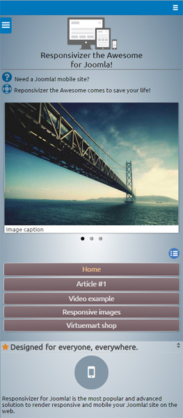
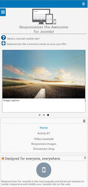
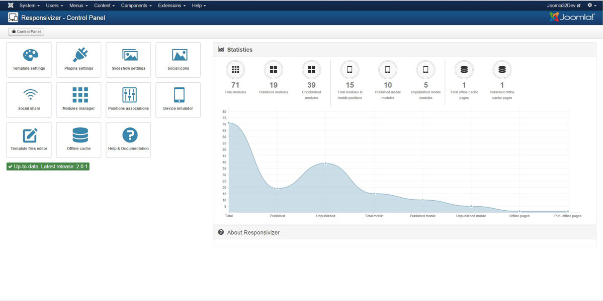
Responsivizer includes every tools and features to manage your Joomla! mobile site:
- Mobile detection and template switching
- Joomla! auto configuration for the Google mobile friendly test
- Native app look and feel – Configure the site to simulate a native mobile app on devices
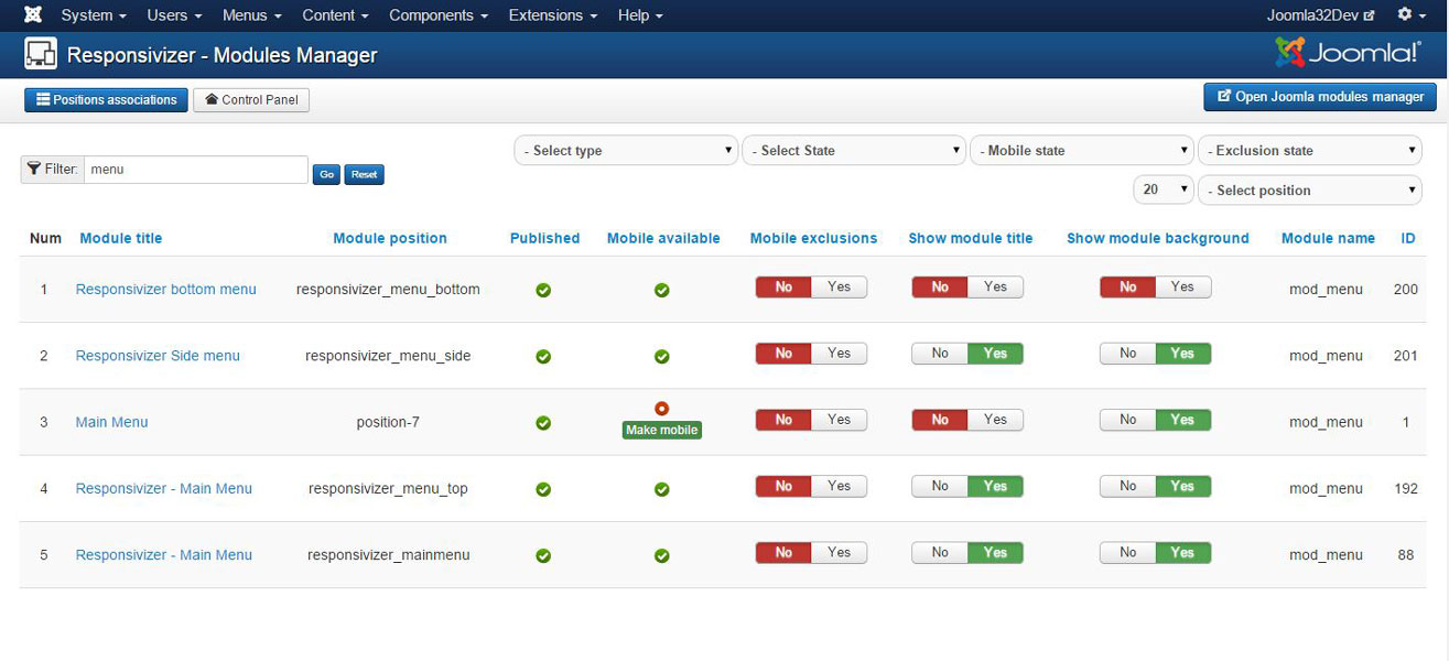
- Mobile elements exclusion and inclusion - Exclude or include modules exactly as you need and where you need
- Adaptation to every Joomla! template - Thanks to a powerful layout framework and the Universal template positions associations™ you can match whatever Joomla! template you are using with Responsivizer
- Offline cache - Use powerful HTML5 offline cache to make your pages still available when connection is lost
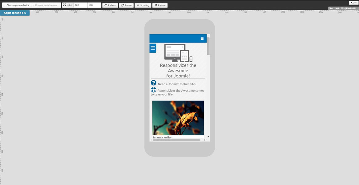
- Device emulator – The integrated Joomla! mobile device emulator™ let you test how your site will be displayed on multiple devices
- Template files integrated editor - You can edit template files directly by Joomla! administration
- Adaptive image resizing and optimization - Speed up your site, save bandwidth using image compression and CSS/JS optmization
- Custom mobile home page - Choose easily to redirect mobile users to a different specific home page on your site
- Redirects - Manage redirects for mobile users to specific menu pages
- Advanced mobile slideshow - Setup easily a fully customizable mobile slideshow that supports touch
- Multiple themes - Use a set of predefined themes to change layout in a single click, best suited themes are available for Android and iOS look and feel
- Easy to customize - A lot of settings will let you customize Responsivizer layout without working on CSS and source code
- Touch optimized - The interface to navigate your site will be optimized for touch devices, to save space and use fingers
- Advanced mobile menu - You can easily configure up to 4 mobile menus in different positions
- Desktop version switcher - Mobile users can easily choose to switch to desktop version of your site
- Mobile click-to-call - Integration with mobile phone number, Whatsapp and Skype
- Additional features - Mobile social icons and social share buttons, footer area and mobile call number, Google Analytics, logo and more, everything is already included within Responsivizer!

نوشتن دیدگاه